Decoding Sherwin Williams Accessible Beige: The Ultimate Neutral

In the ever-evolving landscape of interior design, the quest for the perfect neutral paint color remains a constant. One shade that consistently rises to the top is Sherwin Williams Accessible Beige. But what makes this particular beige so…accessible? Is it merely a trendy hue, or does it possess enduring qualities that justify its widespread popularity? Let’s delve into the nuanced world of this seemingly simple, yet remarkably versatile color.
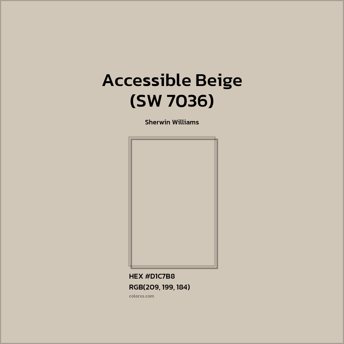
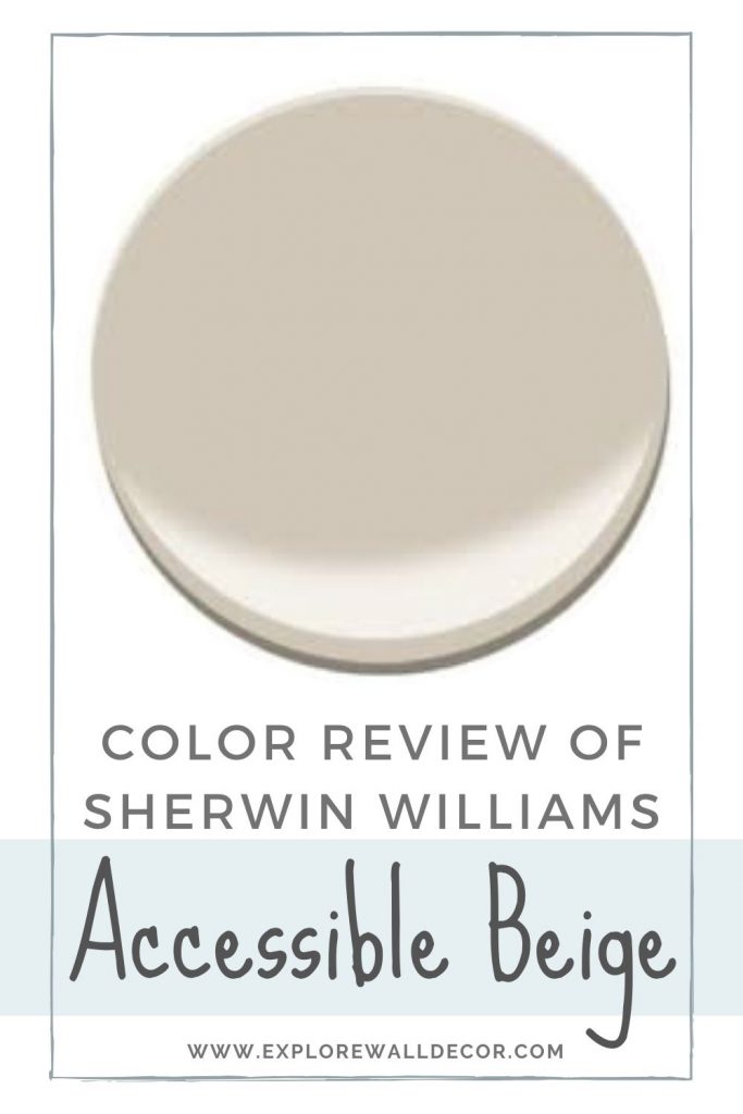
Accessible Beige, often abbreviated as SW 7036, isn't just another beige; it's a carefully crafted blend of warm and cool undertones, resulting in a shade that feels both inviting and sophisticated. This delicate balance allows it to adapt to various lighting conditions, appearing slightly different throughout the day. This chameleon-like quality is a key factor in its widespread appeal, making it a go-to choice for both homeowners and professional designers.
The history of Accessible Beige is intertwined with Sherwin-Williams’ commitment to offering a diverse palette of nuanced neutrals. While the exact origins of the color remain somewhat veiled, its enduring presence in the company's lineup speaks volumes about its timeless appeal. This warm, greige-leaning neutral has become a staple, offering a reliable backdrop for a wide range of design styles, from traditional to contemporary.
The significance of Accessible Beige lies in its ability to create a harmonious and balanced space. It serves as an excellent foundation, allowing other design elements, such as furniture, artwork, and textiles, to take center stage. This neutral backdrop doesn't compete for attention but rather enhances the overall aesthetic, fostering a sense of calm and cohesion.
One potential issue with Accessible Beige, as with any paint color, is its interaction with different lighting conditions. While its adaptability is generally considered a strength, it's crucial to test the color in the specific room where it will be used. Natural light, artificial lighting, and even the surrounding décor can influence how the color appears. Sampling the paint on a large piece of cardboard or directly on the wall is highly recommended to ensure it aligns with your vision.
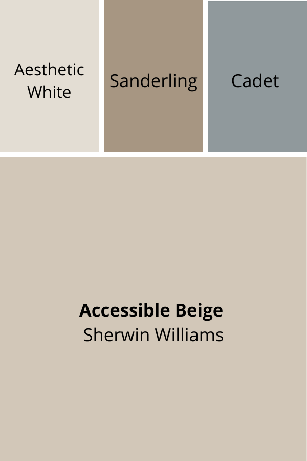
Accessible Beige provides a neutral canvas that effortlessly complements a wide array of colors. Consider pairing it with bolder shades like navy blue, deep teal, or emerald green for a striking contrast. For a softer, more monochromatic look, opt for complementary neutrals such as warm grays, creamy whites, or subtle taupe.
Advantages and Disadvantages of Sherwin Williams Accessible Beige
| Advantages | Disadvantages |
|---|---|
| Versatile and adaptable to different lighting | Can appear slightly different in various lighting conditions |
| Creates a calming and cohesive atmosphere | May require multiple coats for optimal coverage |
| Complements a wide range of colors and design styles | Might be perceived as too neutral for some tastes |
Best Practices for Implementing Sherwin Williams Accessible Beige:
1. Test Before You Commit: Always sample the paint in your intended space to assess how it interacts with the existing lighting and décor.
2. Prepare Your Walls: Ensure your walls are clean, smooth, and properly primed for optimal paint adhesion and color accuracy.
3. Use Quality Brushes and Rollers: Invest in high-quality painting tools to achieve a smooth, even finish.
4. Consider Two Coats: Two coats are often necessary for achieving the desired depth and richness of color.
5. Coordinate with Existing Elements: Consider your existing furniture, flooring, and décor when choosing complementary accent colors.
Frequently Asked Questions:
1. What are the undertones of Accessible Beige? It has warm, greige undertones.
2. What colors pair well with Accessible Beige? Navy, teal, green, gray, white, and taupe.
3. Is Accessible Beige a good choice for small rooms? Yes, its neutral tone can make small rooms feel larger.
4. Can Accessible Beige be used in kitchens? Yes, it's a popular choice for kitchens.
5. Does Accessible Beige look good with wood trim? Yes, it complements various wood tones.
6. Is Accessible Beige a warm or cool color? It leans slightly warm.
7. What sheen should I use for Accessible Beige? Eggshell or satin are popular choices.
8. Can I use Accessible Beige on the exterior of my house? While possible, consult with a paint professional for exterior applications.
Tips and Tricks:
Use Accessible Beige as a backdrop for a gallery wall to highlight artwork. Pair it with natural textures like wood and linen for a warm and inviting atmosphere.
In conclusion, Sherwin Williams Accessible Beige stands as a testament to the power of a well-balanced neutral. Its adaptability, versatility, and ability to create a harmonious atmosphere make it a compelling choice for a wide range of interior design styles. While careful consideration of lighting and surrounding elements is crucial, the overall benefits of this enduring color are undeniable. By understanding its nuances and employing best practices during application, you can harness the transformative potential of Accessible Beige and create a space that feels both timeless and inviting. Take the leap and discover the subtle elegance of this versatile neutral – you might just find the perfect backdrop for your next design endeavor. So, explore the possibilities, experiment with different pairings, and unlock the potential of Sherwin Williams Accessible Beige in your own space.
The subtle art of carbon fiber elevating the e92 m3
Gray hair dont care owning your silver style
Navigating san diego countys compensation landscape


